challenge
The Annual Program Evaluations set out to evaluate the health and education effectiveness of the programs of an institution. These evaluations help to discover where programs are doing well and what needs to improve based on the evaluation question created by the institution guided by the requirements of the set by the governing body, ACGME, to remain in good standing. With a handful of requests of copying the evaluation from the previous year, we set out to understand why customers would want the same answers every year and what we could do to accommodate the request.
solution
Up first was to research the experience of completing the Annual Program Evaluation in its’ current state in our system as it was built before I joined the company. I looked to those of the clients who made the request. Upon opening the form, I found they were taking a solid 90 seconds to even open, not the best start to an experience. The evaluations had 60 to 100 questions along with additional sections of data for those who completed them. The question response type could be numeric, yes/no, and written responses. We already showed the previous two years’ responses but not for written responses. If the user wanted to see those, they would need to exit the evaluation, navigate to that evaluation and open it(adding another 90 seconds of wait time to load). Find the information they desired and then navigate back to the current year’s evaluation. That process alone gave great insight into why they would want to copy the evaluation.
With this knowledge in hand, I set up some interviews with those users that requested to understand their pain points. It was confirmed that was the biggest pain point. What the true problem boiled down to was pure human factors and having enough information available to them to give a response to the question. This changed the challenge from copying the evaluation to providing information to give a response as well as tackle the load time issue.
I brought the load time problem to my outstanding engineers who quickly got on the problem as they could not believe the page load time either. Within a day or so, they had the load time down to mere seconds. Next, I created an addition to the UI so users could see the previous year’s response and copy it if they needed to. I was also able to make a few visual changes to make the experience better. Before we built, I presented a prototype to those who made the copy requests. The solution we created was “even better than just copying the evaluation” one user said because still makes people think about responses instead of signing off on what someone responded the year before. That in turn helps programs progress in their education and not stay stagnant. We proceeded with the build.
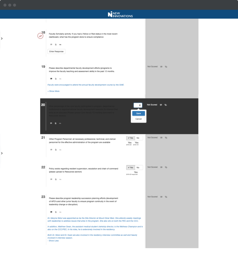
Previous way of entering a value for a question. THE Question was not readable and prior YEAR’S values were covered by the save or cancel button.
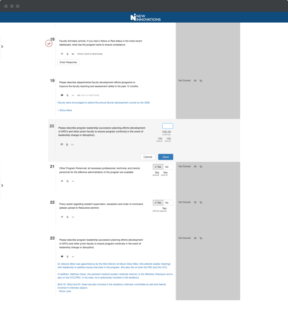
Revised way. The question is now readable to show all information needed to enter a value.
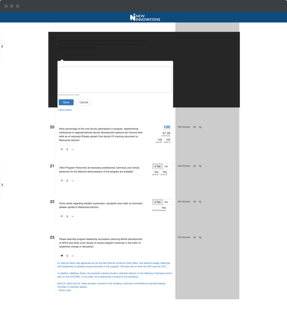
Previous way to answer a written response question. Again, THE question WAS not readable and there wasn’t a way to see the previous years written response.
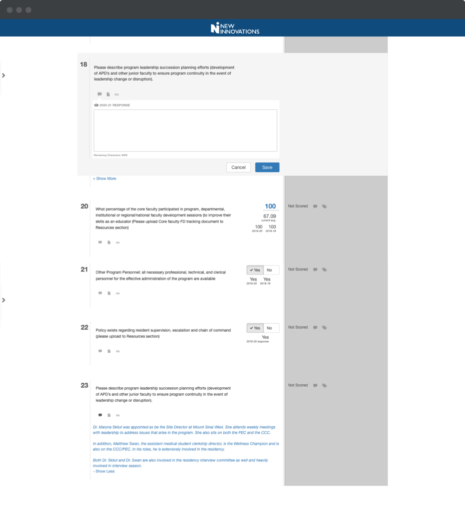
the Questions are now readable and HAVE an option to see the previous year’s response.
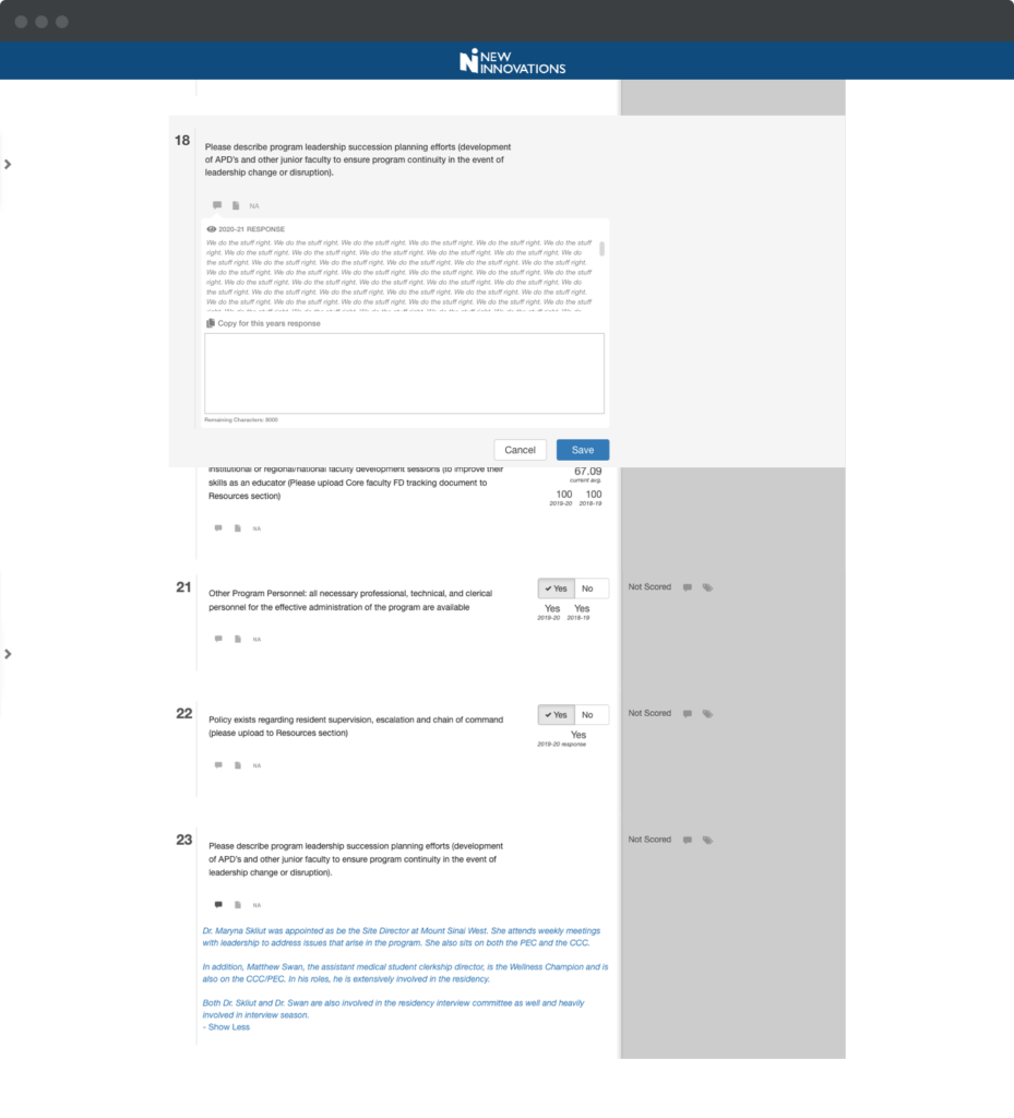
THE Previous year WAS displayed.
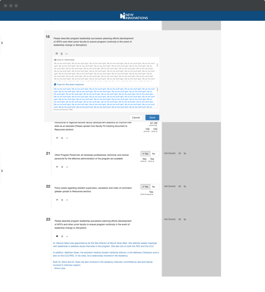
Ability to copy response and use with one click.
Outcomes
Initial reactions have been very positive. The evaluations are still in progress. User interviews and a CES will go out in the fall for further effectiveness measurement.
