Challenge
The ACGME, a governing body for residency programs, sends out an annual survey to residents and faculty to assess the health of the programs they belong to. How can we assist the Graduate Medical Education administration see their programs’ health at a glance? Can we help them see trends in the data year to year
so they can make corrections to the programs if needed? Or see the success of a program from the compared data and apply that program’s processes to the rest of their programs?
solution
Create an easy-to-use system within the software suite that takes the ACGME excel file downloads of the program survey results and presents them to institution administration that can show trending, areas of concern or success, and data visualization. In research, we found most users had some method of doing in a very laborious manual process such as entering the results in an even larger spreadsheet that made it difficult to see trending and little to no visualization. By taking away that manual process we allow their focus to be on what they can do with the results to assist in creating the best for their residency programs and the hospitals those programs are affiliated with.
The system needed three key items to be effective and valuable for our users. Users need to be able to: 1. Upload the files, 2. See the data of the file displayed in a consumable way, and 3. Set thresholds of acceptance of the results for the programs so growth could occur.
the upload
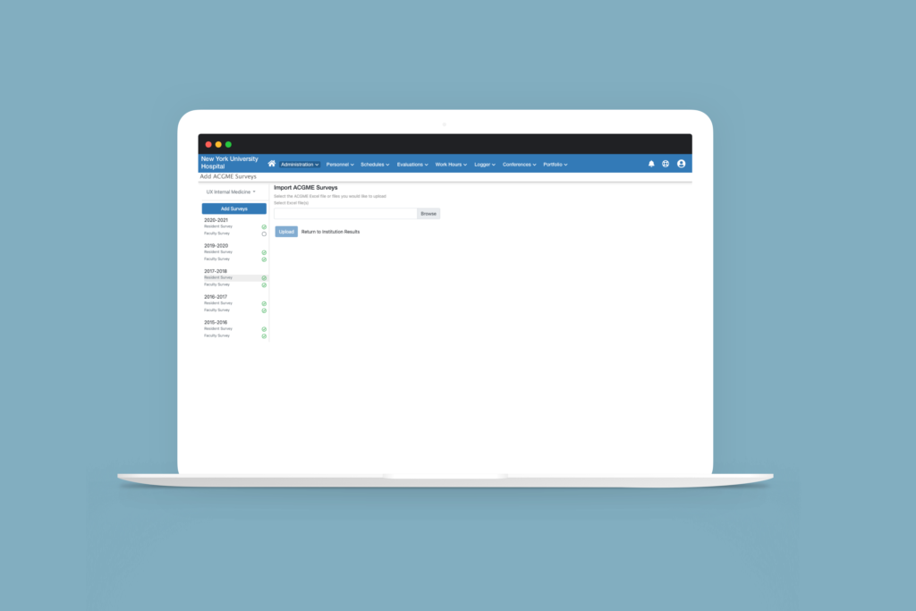
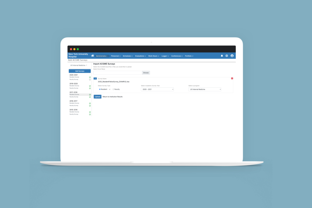
In our research and working with the ACGME, we were able to have sample excel files of what each program downloads every year. The file name carries information that we are able to use to our benefit to lessen the burden on the user during the upload. We could handle the year, program, and survey type- resident or faculty. With this being a new feature, getting years worth of the files into the system was fundamental so the upload needed to handle as much as the user wanted to put in at once. After all, the more uploaded the more value could be gained for the program. And having a fail-safe of showing a warning of discard or replace if the file already exists allows the feature to build trust with the user.

the data displayed
Displaying the amount of data that was contained in the file in a consumable way took many iterations to get to the final result.
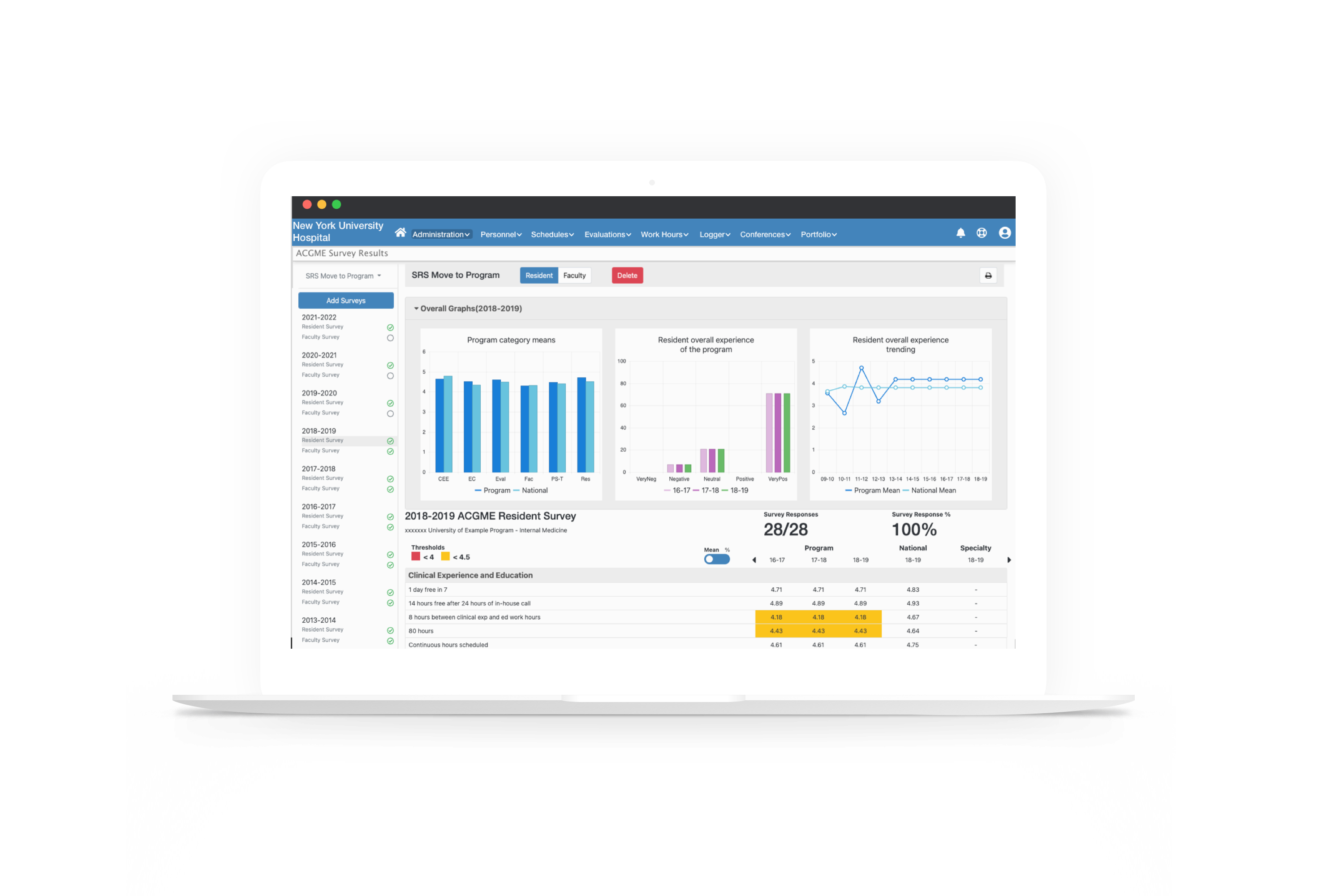
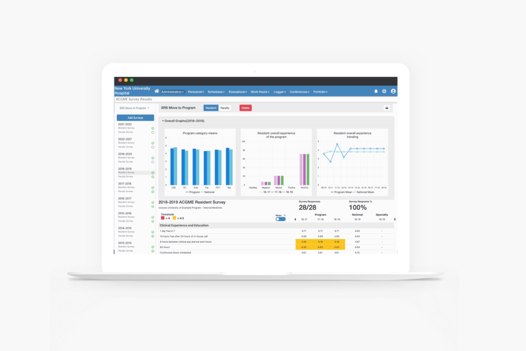
We researched what would be of value in showing as charts and graphs for the programs. Displayed are the overall results of the survey. Placing these at the top gives them instant orientation to the survey results and allows the user to dive deeper into the data in the tables below.
The surveys contained categories of questions with each having a means or percentage value while also showing those values for national and specialty. To achieve this, we created a table containing each category as the header with the overall values and the questions and their values under them. To show trending, the prior 2 years’ values for each category are displayed in columns next to the current year’s values. If the user wanted to see years prior to the three years displayed, we provided an arrow to move back and forth through the years that have been uploaded. To address the preference of the user wanting the means or percentage value we gave them the ability to toggle between the two.
This display of survey results is needed for both types of surveys- resident and faculty. Using a toggle of residents and faculty a the top allows the user to stay in one place to consume all the information they desire.
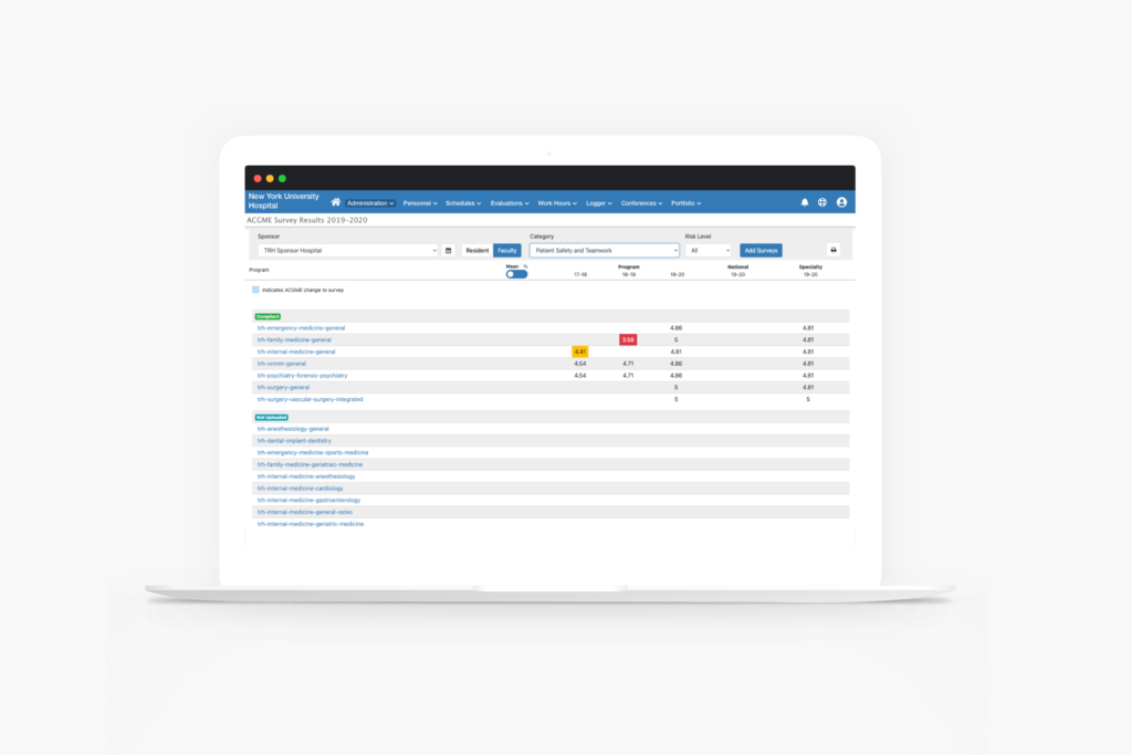
Lastly, there are two levels of viewing these results. A user can oversee just one program or they can oversee all of the programs. We named these the Program View and the Institutional View. The Institutional View is a high-level view that gives the user the overall results of the survey categories, shows where concerns with the programs are, and manages what programs may be in danger as well as which programs have uploaded their results and who have not. From this page, the user can navigate to the program’s view to get more details.
Program View
Institutional View
The Thresholds
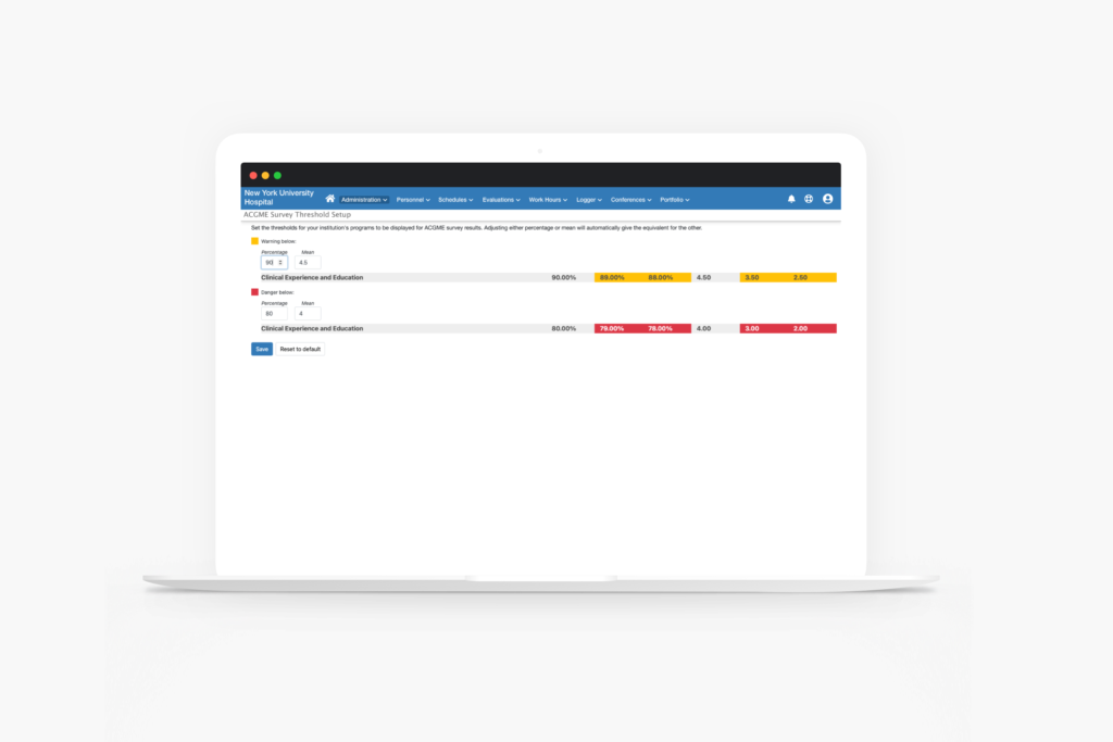
In order to set a level of success for an institution’s programs, we gave the users the ability to set thresholds for that success. This gives meaning to the data displayed in an easily recognizable visual cue. By using a yellow for warning and a red for danger, we allowed the user to set the threshold for each of the two once a means or percent crossed that line into to each respectable territory. If those values fall into those territories, blocks of those colors will appear on the tables on the display page.
outcomes
With the first release, a campaign for the feature was sent out to a sample size of 36 customers. 28 of them had started using the feature with 496 files uploaded across 159 programs resulting in an adoption percentage of 77%. By building this feature as a system, we set a foundation to add more value for the users as more and more use it.

